Fashion Magazine at MIT
Infinite
This post was written by hand. This is not AI-generated slop.
This is worth your time if you are interested in our process and how we built this particular product.
This is worth your time if you are interested in our process and how we built this particular product.

Fashion x Tech
A student at MIT who saw one of our viral webdesigns reached out via X DMs. She and some of her colleagues work on a student-led MIT financed fashion magazine. They needed a landing page that screams tech but still fit the fashion magazine's core idea.

first X DM from our client referencing one of our viral webdesigns
We had one call then jumped straight into Figma. We worked asynchronously on a moodboard and after a few days we drafted the first design concept. Our client accepted right away, so we went straigt to work.
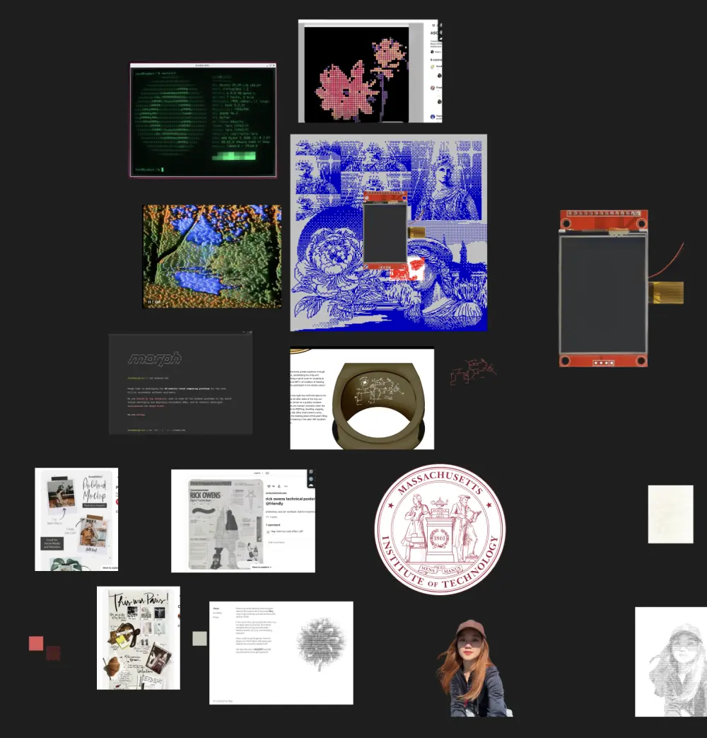
moodboard
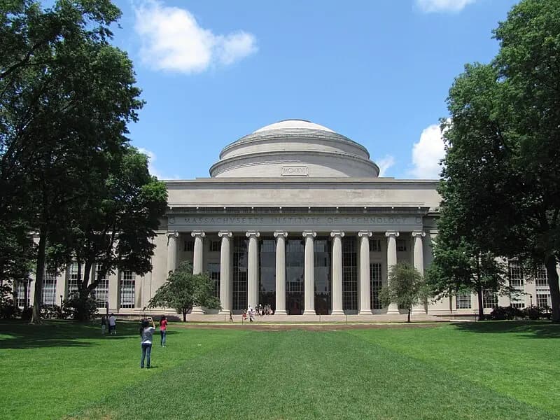
Maclaurin Building, MIT
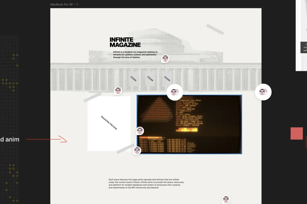
hero section first design draft
team members section first design draft
MIT but make it ASCII
Our client had one specific request: there should be ASCII illustrations. She sent us a few 2D examples but it felt too generic. After some internal discussion we decided to model MIT's famous Macluarin Building in Blender and use a Three.js shader to display it in the ASCII aesthetic.
creating the MIT building 3D model in blender
After a lot of work (most of that went into lighting and the specific spinning animation to make the ASCII shader look good) we ended up with this: showed it to the client and she was ecstatic right out the gate.
final look of the ASCII MIT building displayed on web, rendered using three.js ASCII shaders
Tech Stack
Next.js is a React framework for building highly dynamic server-side rendered web applications
We used Next.js for server-side rendering, and performance gains, it also allowed us to move quickly
Blender is a free and open source 3D software
We created the 3D model of the Maclaurin Building in Blender
Terminals, Microcontrollers and Conway's Game of Life
It was clear from the start that we wanted to have some kind of terminal aesthetic, we chose to go all the way and instead of shipping a standard terminal-ui we decided to implement a retro red and black CTR type terminal that acts as the main issue selector (the magazine is comprised of annual issues)
Closeup of the terminal
When the client showed us the magazine's past cover arts we were immediately convinced that we can't hide those, they look amazing after all. To display the covers we decided to go with a microcontroller screen. We grabbed a common model from google, customized it, removed the background and added a (fake) connector and cables that should 'hook up' the terminal to the microcontroller.
Closeup of the microcontroller screen
Another task was to add some color to the background. To further add to the tech + dev aesthetic we decided to add Conway's Game of Life as an interactive background animation. Conway's Game of Life is a cellular automaton that simulates the evolution of a population of cells over time. It's something that developers implement to test their knowledge of algorithms and data structures, so we thought it would be a nice touch. Users can click anywhere to add a cell to the grid and influence the simulation.
Conway's Game of Life as an animated background
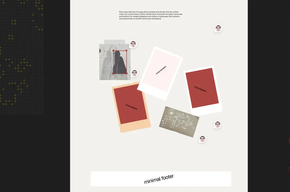
Designing a cutting mat for MIT wasn't on our bucket list
One thing that was missing is a team member section. Initially we wanted to go with 'just' polaroids but dropping polaroids on the pages just like that seemed kinda random. So we pitched our client a cutting mat as a background. Initially we wanted to just grab one but this turned out harder than expected so we just designed a custom MIT themed one ourselves.
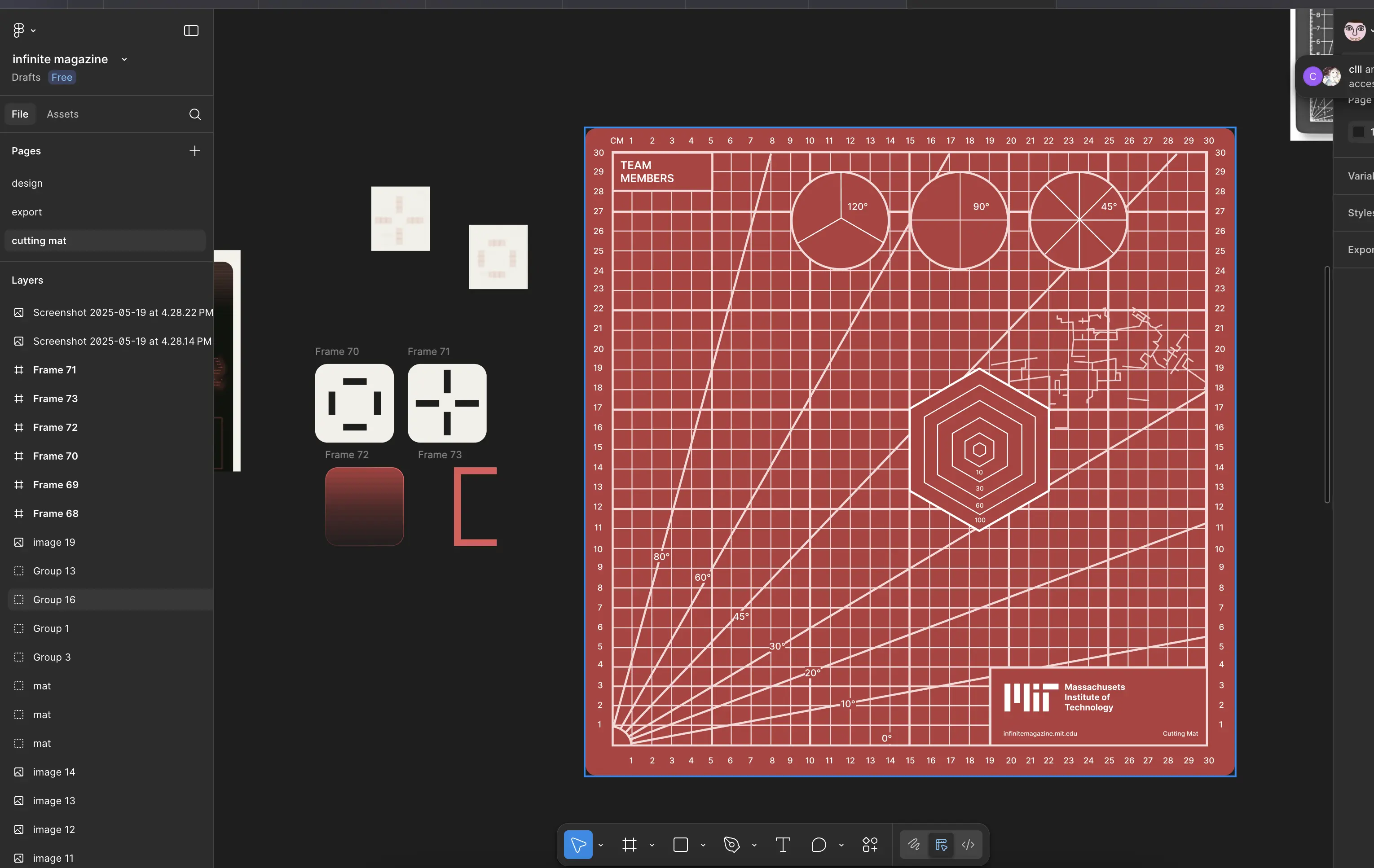
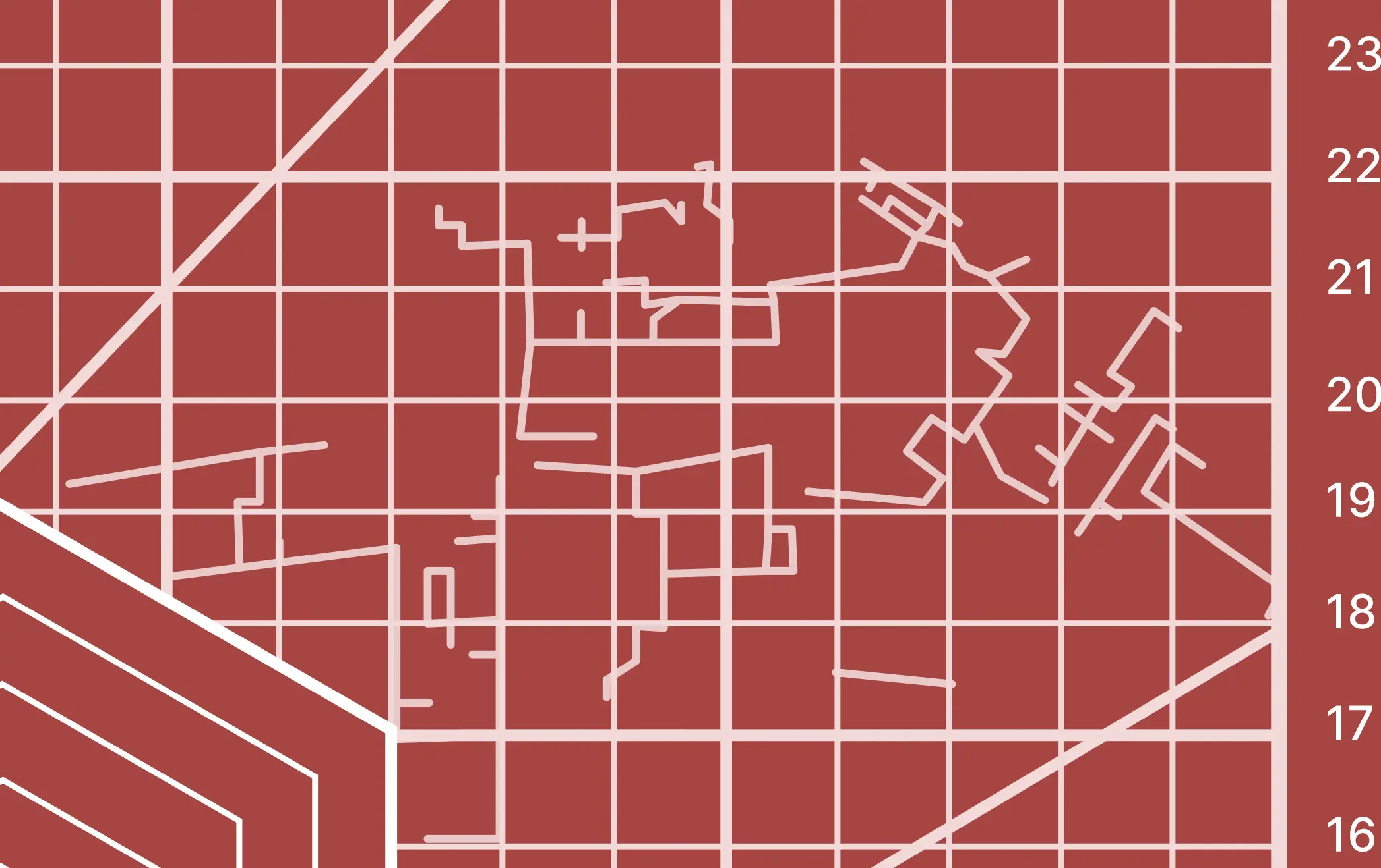
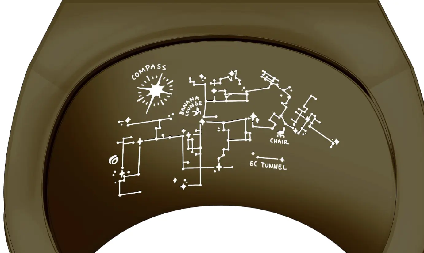
We added a few easter eggs to the cutting mat. One of them is this 'hacker's map' featuring the MIT skyline and a beaver (the MIT mascot), this map is also depicted on the MIT graduate ring.
The cutting mat acted as the perfect backdrop to add the polaroids. To make them tie in we converted all team members to ASCII and added an unveil effect (a drag-and-drop box to show the team member image on top of the ASCII text).
Closeup of the polaroids and ASCII unveil mask


Other Projects

LISAAI for the automotive industry

0credhiring platform for tech

Lucky Mealrestaurant discovery app

ZeroLeakinvisible, on-device watermarking

Mouthbreatherfixing bad breathing habits

EU-GPTsafe, local AI for DACH countries

The Sent Projectviral twitter platform

Pocacollectible cards for creators

Buoy helps you stay focused

Undead Domainsmarketplace for domains

Ampassplatform for digital art
